
On Storefronts
Hey there! Happy March. A lot of things to celebrate this month: Spring Breaks, St Patrick’s, Opening Day (in Korea!), Pi Day, Ides, and of course, 311 Day. The school lacrosse and travel softball seasons roll inexorably along for the Banks family. In Georgia the annual spring pollening is upon us, and so a young man’s thoughts turn to . . . storefronts.
What makes a great storefront? Maybe this is the most-asked question at Revel? Easily top five. For those that don’t know us well, our core business is being the retail developer in partnership with non-retail developers. Amongst the many mysteries of the ground plane, it seems that storefronts are the most mysterious of all to our partners and clients.
There are rules. You know there are rules. You wouldn’t be here if you didn’t suspect so. Given the awful nature of much mixed-use retail you’d be forgiven for thinking that the first rule of storefronts is that we don’t talk about storefronts. This has to change, but fear not! As a society, we can do better.

Maybe we can bring upholstered doors back.
1. Quit recessing them from the building façade above. Good lord if there is only one rule this is it. Unless you’re building an elegant European-inspired shopping arcade. But while I wish otherwise I don’t think anyone on this distro list is building an elegant European-inspired shopping arcade (if you are please call me).
2. You actually want the storefronts to stick out a bit from the building above. Anywhere from a smidge to boatload.
3. In fact look for opportunities to stick the windows way out. Bay windows are going to make a comeback (so are cigarettes btw: you heard it here first).
What we’d give for an elegant shopping arcade (at least we can try to add a bay window or two)
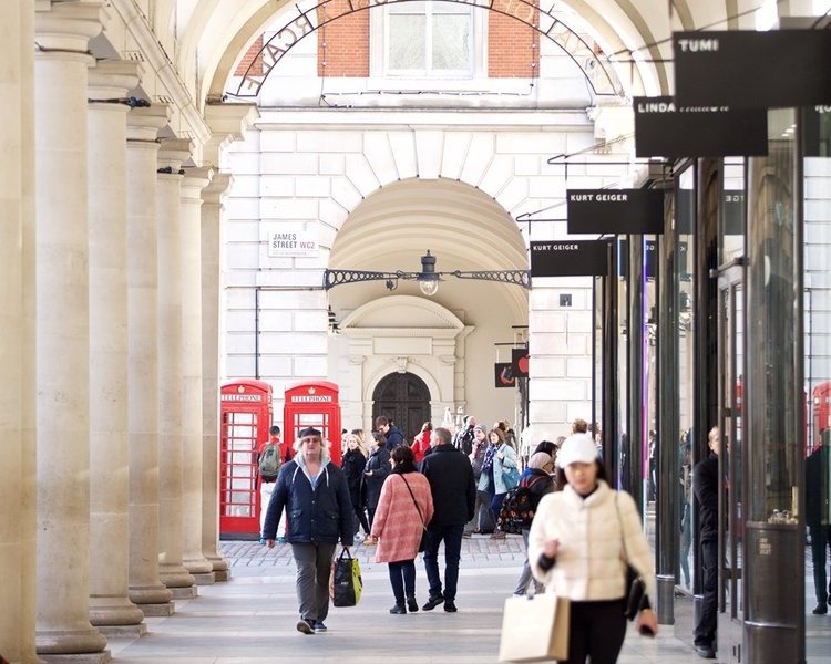
4. The Brits are really good at storefronts. If you have the chance you should walk around London for three days just for inspiration (and maybe for the animal parts).
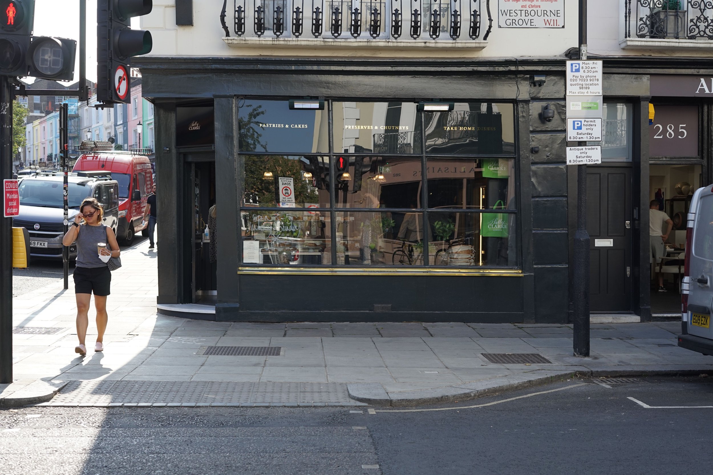
5. Avoid floor-to-ceiling or wall-to-wall glass, unless you’re in the hands of an expert. Obviously this is a challenge for the office folks with modernist glass boxes. And always exercise great caution when playing Ground Floor Architect, unless of course you are under the influence of heavy narcotics or hallucinogens. Then fire away.
6. Bulkheads (the little walls below the window) are your friends. There is nothing to buy on the bottom shelf and you don’t want to look at diners’ feet.
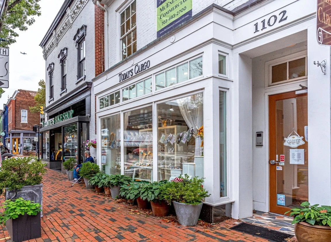
7. Bulkheads let you put benches and potted plants in front. Now you’re cooking.
8. We said don’t recess the storefront, but pushing the entrance back a little is a lovely touch.
9. Push the door to one side. This gives the user maximum flexibility and leaves room for a patio or for putting their wares out on a sunny day.
Blade sign, window sign, wares on display, bulkhead, bench, recessed door to one side: what’s not to love?
10. Ceiling heights, like the rent, are too damn high. As a society we have to stop building twenty-foot tall first floors. This is a whole other note, don’t you fret.
11. Maybe let the tenant handle it? It doesn’t mean you avoid the cost, it means extra TIA. The upside is a lot of variety. The first downside is plywood. The second downside is that most small tenants have never actually designed a storefront, and now you’re in the hands of their architect who probably isn’t an architect. Let go, let God.
12. I’ve softened on awnings. Used to hate them. Canvas ones get dirty and metal ones are expensive. But when done right boy they’re great, and provide a nice visual variation of elements, as well as signage opportunities and shade.
Without awnings.
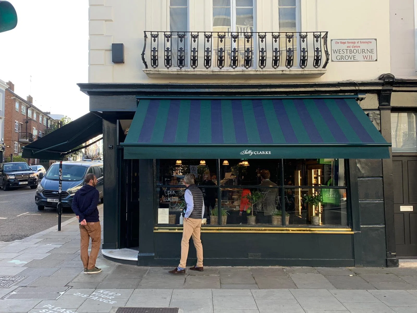
With. Definitely an improvement.
13. Signage! That’s another note. Create some loose guidelines, say yes to neon, say no to light box signs, get out of the way and hope a little magic happens.
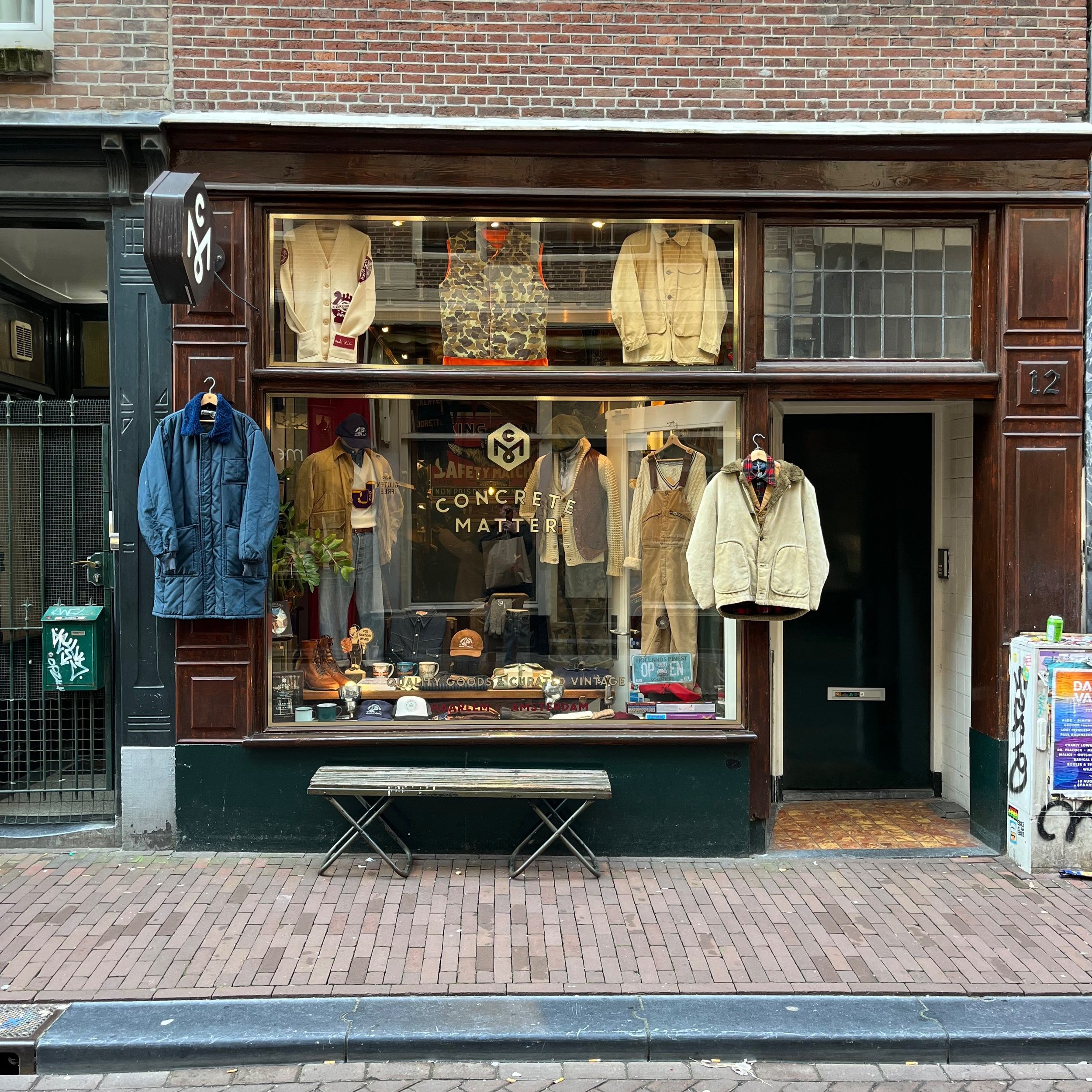
14. You gotta have blade signs. All the joy is in the blade signs. We’re supposed to be having fun here. When the blade sign doesn’t actually have any words but maybe is just a taco or an ice cream cone or a book? Fantastic.
15. Painted signs on the windows are to be encouraged. Sometimes it is a dramatic improvement over any sign you could put above the window (and bonus, at eye level so that you know that sandwiches and natural wines are near at hand)
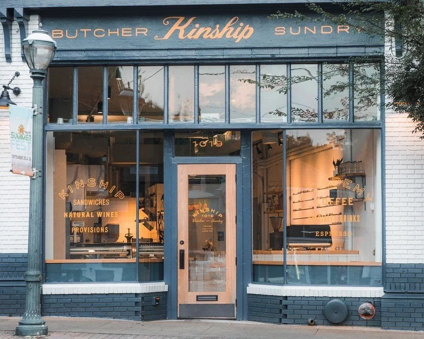
16. Storefronts should often be a different material than the building on top. Something with some texture and detail to it. Destination retail is meant to be appreciated at slow speed, on foot, up close. The things you put at the top of a building to be seen by speeding motorists won’t always cut it on the street.
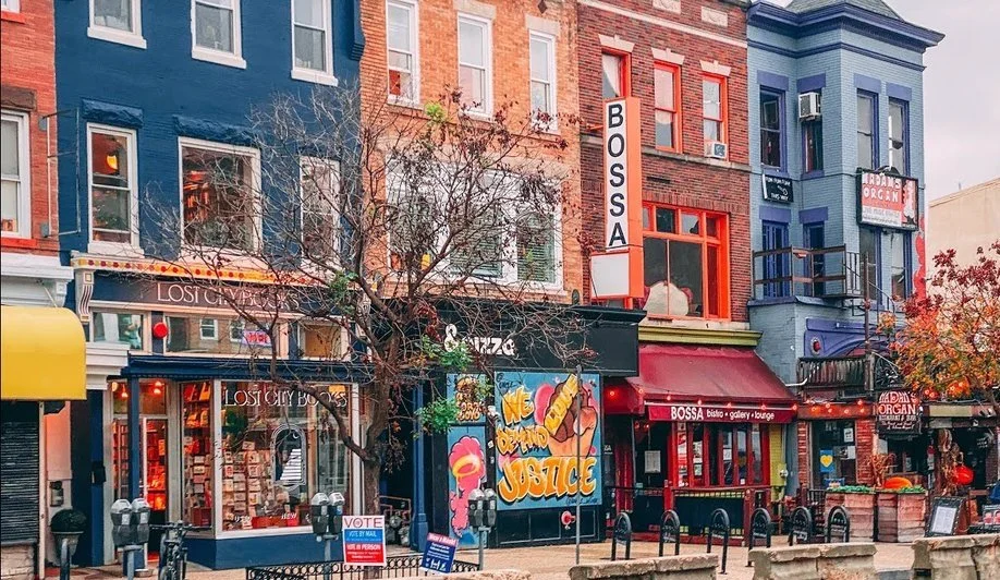
17. Don’t be afraid to get tiny with your spaces. Like ten-feet-wide tiny. More tenants are better than fewer, because more tenants help carry the weight of placemaking, and because as we’ve said here before the answer to Credit is Fungibility.
18. There is almost no such thing as too much color.
There are dozens of other best practices but hopefully I’ve given you a taste of where this should go. Maybe I buried the lede, but it all starts — as with every great retail project— in asking who you’re building this for. If this is a Big Tenant Shopping Center then the good news is that you really don’t have a say. Your tenants are going to come in and dictate what their storefronts will be.
But for the interesting spaces in between, for the small strip and and the urban infill and the adaptive re-use and for the placemaking, then you’ll have a big hand in how your building meets the street. Think it through, expense a trip or two to New York and London for research, cut loose and have some fun with it. What’s the point of retail if we’re not having fun?
What We’re Working On. New projects in Kentucky, Florida, Texas and California. Trips to Tulsa and Detroit on the books. If we’re lucky, a return trip to Juarez as well. Spring ULI is around the corner. I’ll be speaking at a Bisnow event in Northern Virginia next month if you’re around. And of course if you’re in Atlanta please drop by our Westside Motor Lounge and let me buy you a round or two.
What We’re Reading. Do you know James and Karla Murray? For years they’ve been taking great photos inside and out of the stores, bars and restaurants of New York City. Their books are fantastic, and if you want a great primer on great storefronts, look no further.
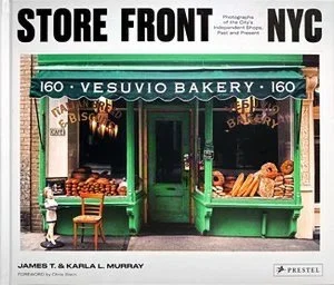
What We’re Reading. Do you know James and Karla Murray? For years they’ve been taking great photos inside and out of the stores, bars and restaurants of New York City. Their books are fantastic, and if you want a great primer on great storefronts, look no further.
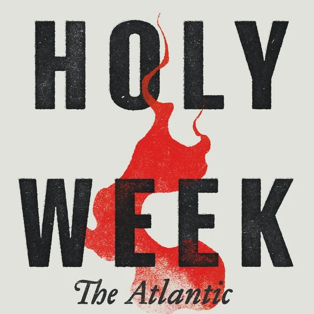
What We’re Listening To. It came out last year but timely to listen to now, Holy Week from The Atlantic is a fantastic podcast that explores the events that exploded in America the week after Martin Luther King Jr was assassinated before Palm Sunday, 1968. A must-listen for the DCers on this email: though this is a national story events in the District play a prominent role.
Thanks for reading! If you’ve enjoyed this, please forward to a friend. If you’re getting it for the first time, you can subscribe via the button below.
For those new here, I run a retail development and consulting shop in Atlanta, and I write semi-regularly about commercial real estate.
If you’ve got a mixed-use project that could use some creative thinking — or just want to chat about storefronts— please reach out. We’d love to hear from you.